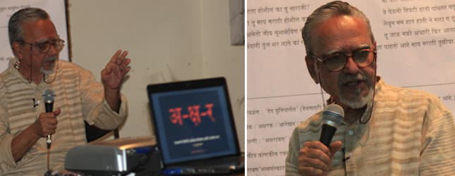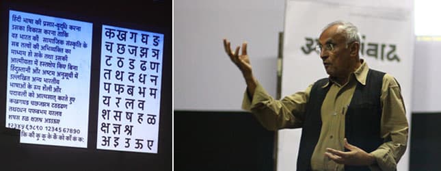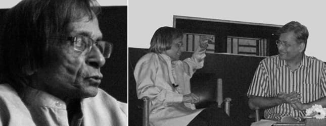
In the history of Devnagari Typography, the contribution in the area of ‘Typographic Design’, made by Shri Kamal Shedge is simply unparallel. In his long professional span of over three and half decades, (starting from early 60s), Shri Shedge has made people look at the letters as a ‘beautiful’ experience. Shedge, who was not a student of an art school, started his career as an artist with ‘Maharashtra Times’, which was started around that time, and later became one of the leading daily in Marathi; of Times group. Though he worked mainly with ‘Maharashtra Times’ he lent his golden touch to other publications like ‘Madhuri’ of the Times group.
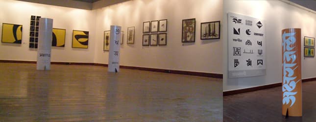
Around this time he got an opportunity to work for Late Shri Mohan Wagh. Shri Wagh started a drama production house called, ‘Chandralekha, which staged many Marathi dramas. Since the first drama of ‘Chandralekha’, Shedge has been designing titles for these dramas since then. In the month of January 2011, he had organized an exhibitionof the Posters of 80 dramas produced and staged by ‘Chandralekha’, over a period of about 50 years; as a tribute to his dear friend, philosopher and guide Late Shri Wagh.(Rayagadala Jevha Jaag Yete, Garambicha Bapu, Swami)
This was the pre-computer era.
“I always sketched my letters with pencil,” Shedge was describing his process of work. He further added, “The look and feel of the letters should be ‘tight’. That is… letters should be well structured and compact. Till today I use simple tools like ruler and set-square. Some times I structure my letters on a graph. After a pencil sketch, I ink it out. Now the ‘art work’ is ready. A negative is taken to tryout various sizes, suitable to the size of advertisement.”
The drama advertisements were (and still are) heavily influenced by budget. Creating impact in the narrow single column size advertisement was a task… difficult but not impossible. Shedge not only offered his distinct touch these advertisement but they were lessons in graphic design. His play of black and white is mesmerizing.
“My designs are conceived mainly in black that give me an idea of its graphic quality and impact. To enhance the impact further I also like to add a suggestive element in the title.” (Mee Lata boltey, Matsyagandha, Naagmandal). In many of his titles, he has played with the shape of the letters or simply created an interesting patterns with the vowel signs.
Shedge did not limit his lettering skills, only to the drama advertisements but he also designed many titles – logos for renowned publications like “Maher”, “Deepavali”, He is the designer behind the phenomenally famous “Kalnirnay” almanac – calendar.
Unfortunately Shedge never got into font-designing. He has developed few styles almost to the level of the basic character set, but one does not see extensive work done further. May be the unavailability of technology then and obviously the unconditional help that technology can offer, must have simply not been there for him.
After dramas, films have to follow. ‘Bayo’, ‘Ek Full Teen Half’, ‘Ek Ratra Mantarleli’(for which he got an award), ‘Bhool Bhulaiya’, ‘Pyare Mohan’, ‘Sarkar Raj’, ‘Umrao Jaan’, ‘Drona’, the list is endless.
“Do you feel that you have missed out anything in the life…?” He smiles and answers, “Yes… I can not handle computer. But I have an earnest wish to learn and master it.”
Today, the impact of Shri Kamal Shedge can easily be noticed. And that is the success of his work. He made the presence of letterforms felt. His exhibitions of his own work are well attended. He has done his bit of popularizing the art of letters, before its time. In a way he has paved way for many designers in a popular manner. Today the applied lettering is seen with seriousness and as a result awareness about the letterform is slowly increasing.
Today in his seventies, Shedge still works for hours together. When asked, this man of few words… quotes Late Shanta Shelke’s verse with a slight change…
Asen mi, nasen mi
Pari asel akshar he…
(I may live…or may die… but what will remain after me… is this letter!)