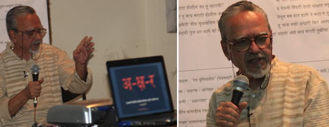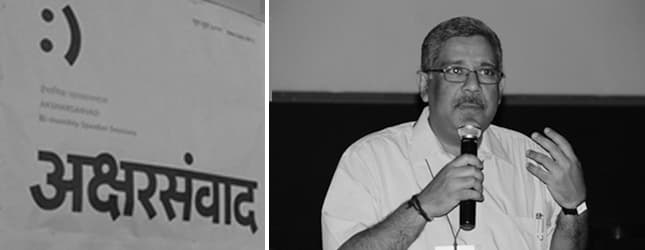
Title of the Talk: 🙂 Typography Student’s Perspective
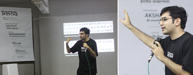
Faculty of Typography at the Industrial Design Centre, Prof. G.V. Sreekumar is one of those persons who has had the privilege to design a Malayalam typeface on Vinyas, the skeletal approach based font design software developed by Prof. R.K.Joshi. He is known for his work in the magazine publication industry for renowned magazines like Autocar, Intelligent Investor and Chandamama.
The title of this talk, being :), it was mainly based on expression of type and its usage. He elaborated on several aspects that need to be considered while choosing a typeface and how this choice affects the reader. If a chosen typeface is inappropriate to the content that it holds, it may communicate a completely opposite message to the audience. While fonts like Lolita Scorned, Brody, Samarkan, Snell etc are highly expressive and distinctly create a particular atmosphere or mood, others like Univers, Franklin Gothic, Helvetica, Futura etc. are considered to be non-expressive fonts that are more or less neutral.
Prof. G.V. Sreekumar presented to the audience several examples of expressive typefaces where type has been inappropriately used thus portraying a wrong message. One of the examples was a hand painted signboard of a photo studio called ‘Vishwas’, in which the letterforms are created in such a way that they look like flames of fire. This effect adds a very negative connotation to the signboard, almost like mutely communicating to the customers that they are unwelcome. But if the same effect was used for something like a horror movie, it would probably have worked, since it would then suit the context.
Along with unsuitable font selection, he also showed several other examples which demonstrated illegible type, spelling errors, incorrect word usage, inappropriate hierarchy in typesetting etc. Thus, type expressions depend on not only choice of typeface but also on typesetting parameters. The form should emerge from the content. They cannot be independent of each other. The form must visually communicate the same expressions as that of the content.
While explaining this, Prof. G.V. Sreekumar made a very interesting comparison. He said, choosing a typeface is like choosing an actor for a particular role. The actor must suit the role perfectly. Even if an actor is very talented independently, if he does not suit a particular role, the final output may become a fiasco.
Similarly, incorrect choice of type could ruin an entire design. This choice must be made keeping in mind, the sender, the receiver, the message and the medium. The factors that affect font selection are, Content/ Grammar/ Tone, Hierarchy, levels of information, Method of reproduction, Materials, Ergonomic Analysis, Time available for Use, and Consideration of Reduced Span (RAS). The design attributes of the typeface like, x-height, serif, counter, stroke contrast, kerning, grey value, weight, width style, ligatures, numerals, symbols etc.
He also presented before us, examples of typesetting in publishing where text has been badly aligned creating unpleasant rives and bubbles. He explained that while justified text during the days of letterpress printing was neat due to human input on the arrangements, it can go badly haywire today because the software cannot think. It does a very mechanical job on the text due to which often the text becomes very difficult to read. To justify this point he shared with us, Emil Ruder’s quote, ‘Typography has one plain duty before it and that is to convey information in writing. No argument or consideration can absolve typography from this duty’.
Prof. Sreekumar also threw light on what could be the prospective research areas for Indian Typography, like Readability of Indian scripts, text setting parameters, font creation in Indian scripts, Text input systems for Indian languages for new media, Multilingual typography and typography of manuscripts. He then proceeded towards the scene of Design education in India today and what could be the future prospects. With his reputation as a person who makes learning light and fun, Prof. Sreekumar said that we need to understand the psychology of the students of the new generation and guide them accordingly. Thus the session conducted by this noted teacher was immensely informative and inspiring.